
updated 5/19/2025
brand style guide

mission statement
A dream is just hope until you act on it.
An obstacle is just fear until you conquer it.
A destination is just a goal until you start the journey.
So make your move.
We’ve got your back.
We’re here to create the confidence, the community and
the connections that can transform your dreams into reality.
A real place you can call your own.
A real space you can make your own.
The realized goal of being on your own… but never alone.
Because we’ll be right behind you.
Cheering your success when we see it.
Supporting your business when you need it.
And creating a culture of confidence that exudes it.
We’ve helped dream-chasers become doubt-shakers and ultimately
dream-makers across creative communities from coast to coast.
Ready to chase your dream? We are.
My Salon Suite.
creative space. creative people.
brand colors
Our brand colors are distinctive and distinguishing assets of the brand. They are modern and saturated for a rich aesthetic. They include a warm, cool, neutral and black to balance out the palette.
golden saffron
CMYK: 2 9 34 0
RGB: 249 227 178
#F9E3B2
spicy lava
CMYK: 0 80 95 0
RGB: 241 90 41
#f15a29
cool seafoam
CMYK: 50 0 19.53 0
RGB: 120 205 209
#78cdd1
sleek black
CMYK: 33 33 33 100
RGB: 8 0 1
#080001
downloads
Brand StyleGuide (PDF)
My Salon Suite Brand Style Guide
Brand Playbook (PDF) (internal only)
My Salon Suite Brand Playbook
Brand Elements (images and fonts)
My Salon Suite Brand Elements
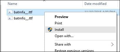
Installing Fonts on your Computer
To install a font on Windows: Right click on the font file, then choose Install from the popup menu:
To install a font on a Mac: Double click the font file, then click Install Font:

brand fonts
Our brand fonts are limited to the Albra Book
and Cera font families.
Albra Book is our primary headline font and
should always appear in ALL lowercase
letters. Albra Book should be used in the
semi weight and can have tracking set
anywhere from 0 to -40 as spacing and
composition dictate.
Cera is our primary sub-head and copy font.
Cera should be used in the weights of regular,
medium or bold as your copy hierarchy and
composition dictate.
example subhead
lorem ipsum dolar set amir
Et as arionet ullorep ellanitis debisci uscipissitio cum fugit viduntias endam, et atur, cum dolecto ex explitis non.
write it right
When writing the My Salon Suite® name in text, “My Salon Suite,” the first letter of each word should always be capitalized. The name should never be italicized. The name is always singular.
The Registration Mark (®) should be placed immediately behind the name on the first mention on each page.
official
My Salon Suite
unauthorized
MY SALON Suite
My Salon Suite
MY SALON Suite
my salon suite
My salon suite
MY SALON Suites

photography
Our photography should show engagement with either people or the camera. Our photography style is all about the community and connections that we deliver. So the subjects should be less posed and show a spontaneous engagement with their peers, their clients or the camera. And when showing spaces without people, the individual personality of the space should shine.
Our photography is not meant to simply document people in their space doing their job, but living their dream.

elements

color bars
Our brand colors are used to create one of our defining brand assets – our color bars.
Our color bars can appear vertical or horizontal and colors should appear in the color order shown here.
Our color bars should be used primarily on a black background with the black edge always anchored to the top/bottom or right/left edge of your composition

cascade
A cascade created from the pillars of our M graphic can be used as an accent pattern for use in brand communications and spaces.

my mark
The unique stylized MY portion of our logo is also a brand mark designed to be used as a graphic asset to support benefits & messages associated with My Salon Suites®.

my mark examples
MY graphic assets can be used in any of our brand colors dictated by composition.

y mark
The unique stylized Y portion of our logo is also a brand mark designed to be used to accent the complimentary use of brand words like YOU and YOURS. And in some cases, words that end in Y.

y mark examples
Y graphic assets can be used in any of our brand colors dictated by composition.
Any use of the term “The Suite Life”, “Suite Life” or any variation thereof is not permitted. This includes the Welcome Video many Franchise Partners have in their email signature. Please double-check that you have removed this from your marketing materials and email settings.
